Brand
A brand is more than just visuals. It is the soul of a company, driven by the beliefs and values of its employees. To truly understand the target audience, there must be a deep dive into their preferences and behaviors, using insights and data to craft a visual identity and voice that resonates with them. By listening to what the company stands for and aspires to be, the brand can be felt in every aspect of communication, from the website to the customer service team, the welcome email, and even the invoice. Ultimately, the impression created by the brand plays a vital role in helping the business achieve its goals.
In order to gain new customers, Quill set out to modernize the brand. Having a rich history of loyal customers, Quill needed to stay true to itself while evolving along with its customers, emerging office needs, and new workspace environments. We wanted to build a relationship, offer value beyond transactions and show up in a relatable, human way. The customer is very busy, wearing many hats, our goal was to develop an experience that is focused, organized and an easy path to purchase.
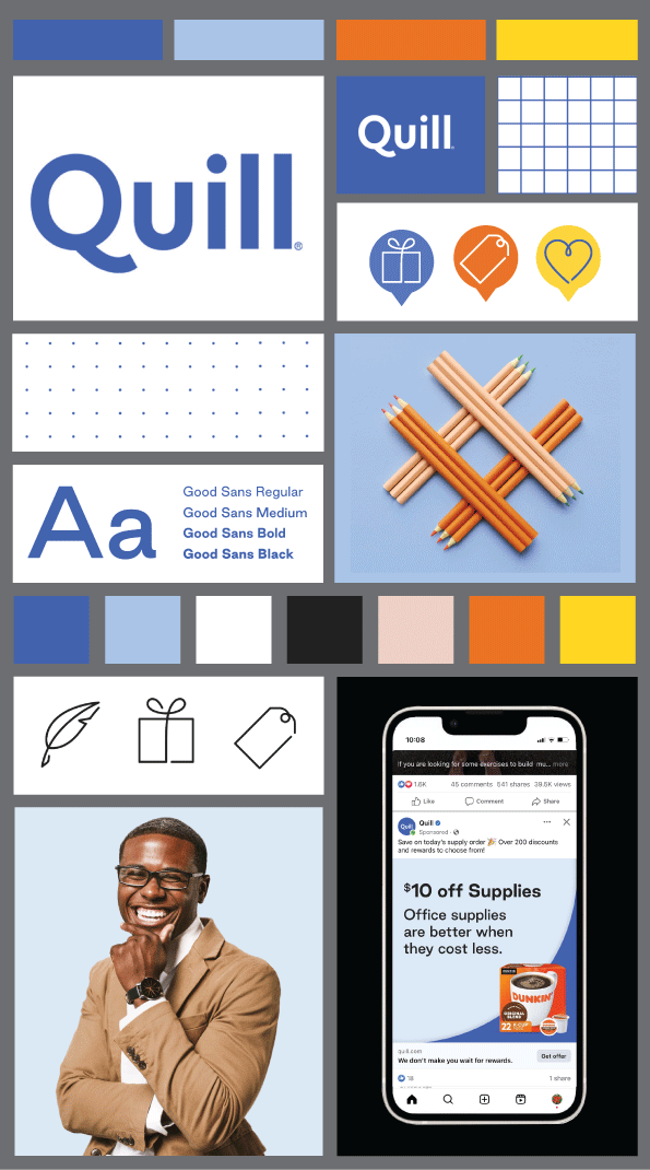
We minimized colors to establish a stronger visual recognition, keeping the longstanding, loyal Quill blue at the heart of the palette, but slightly shifting to a more celebratory tone. Secondary colors compliment the blue, gray and black palette with promotional yellows and oranges. These splashes of warm, friendly but bold colors help to establish promotionality.
The logo uses a strong, sturdy font, with a slight human flair in the Q kickstand, acting as a warm hug and providing playfulness. The primary brand font, Good Sans, has a soft approachable and fluid feel, while still confident and legible.
The design layout is simple, organized grids, broken up by moments of icons, playful patterns and organic shapes.
The voice is warm and genuine, yet knowledgable and always ready help!
Quill
Homepage
The homepage is versioned by existing and prospect customers, organizing the most relevant content for each. A clean site header helps the customer to focus on the main panes but still allows them to navigate if they know what they are looking for. Rotating promotions are featured boldly in the primary position. In the second position, categories either indicate what Quill sells to a prospect customer, or begins the purchase path for existing.
Promotional emails
Emails are sent daily featuring the promotional offers. To keep the header simple we feature only three of the top categories, headers and footers are consistent. The design is simple and clear, each offer separated. We use patterns and icons to lighten up the structure. And we feature the product or offer boldly.
This informative landing page brings to life the human element by relating to the customer. We share the benefits Quill offers, then move into the tactical ways we help them achieve their rewarding work day.
About Quill landing page
Social media
Paid social media ads were used to target prospective Quill custoemrs. These featured aggresive offers to entice the a click thorugh. Organic was used to build a relationship with our customers, showing the more human side of the brand.
Paid Meta ad
Organic Instagram ad
Paid Meta ad
Direct mail
Direct mail is still a core channel for Quill, however, it has shifted. The mailings are much more targeted. When customers visit the website, but do not convert, the pixel triggers a print on demand postcard that is relevant to the landing page they were on. For instance, if the customer visited the shipping category, they receive an aggresive offer on shipping supplies. The offer is the main focus, but the visuals tie back to the category they had interest in.
Shipping Supplies Postcard
Promotional Postcard
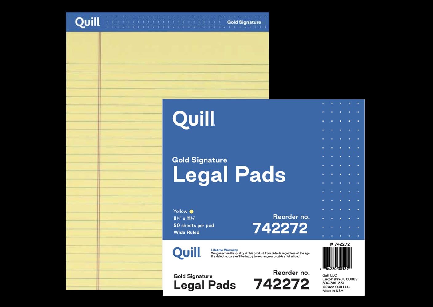
Own Brand Packaging
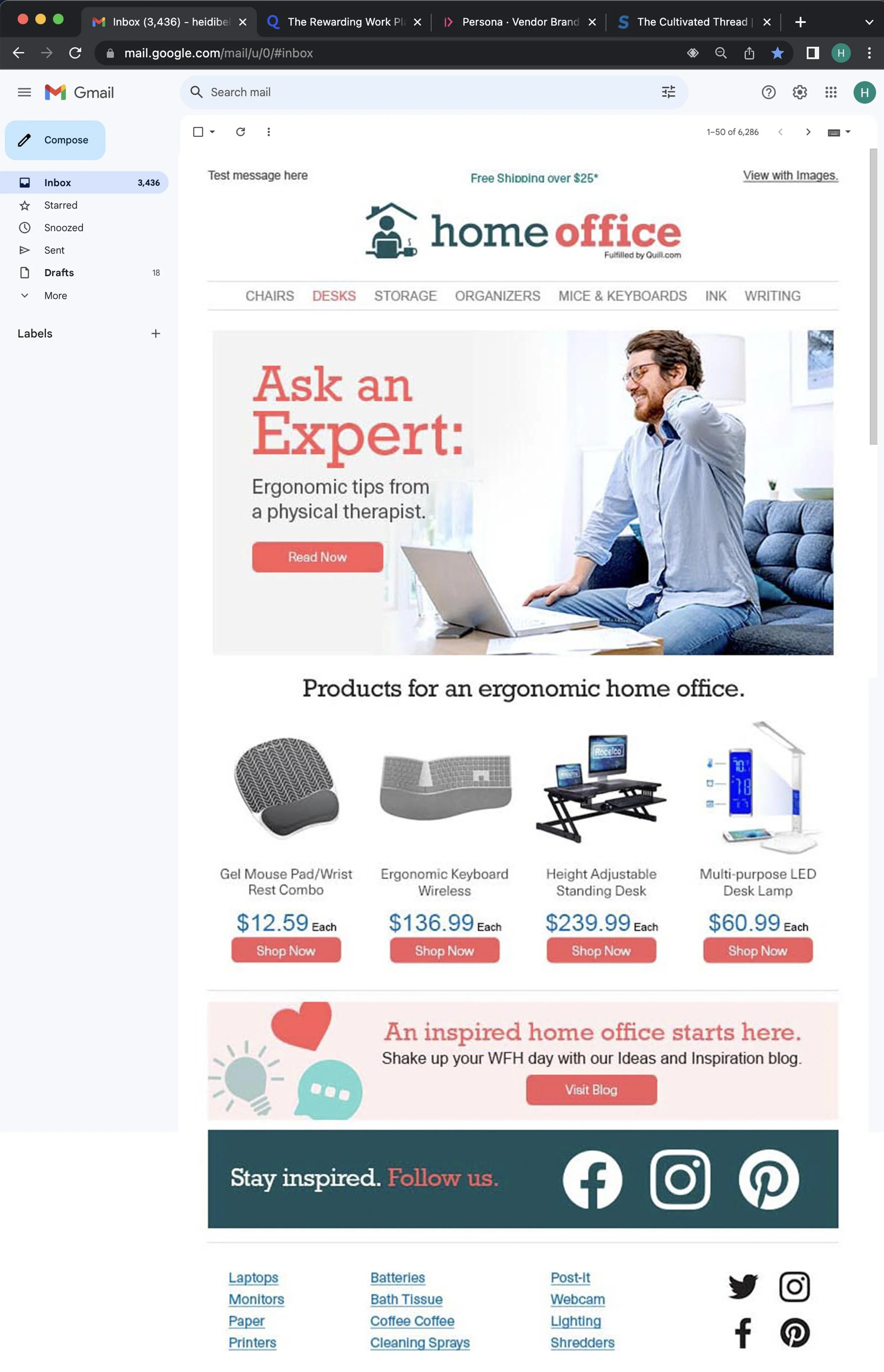
HomeOffice
HomeOffice is solely focused on the needs of work-from-home (WFH) workers, offering the products and guidance needed to successfully create a unique environment that inspires a productive workday.
Products are curated to meet the needs of WFH workers: desks designed to fit in smaller spaces, and tech that connects people like monitors and webcams.
HomeOffice also provides useful guidance and advice on working from home for our customers by partnering with experts, bloggers, designers and influencers.
We chose an inviting, fresh color palette with a base of deep trustworthy green and hints of playfulness to bring relatability. The gold patterns slightly elevate and modernize the visuals. Photography is not staged, intended to feel relevant and not traditionally corporate.
The font is serif to create fluidity and motion. The overall format is light and airy to create organization. Our voice is relatable and approachable, but knowledgable.


